 BytArc
The BytArc concept
A byte and an arc.
BytArc joins two ideas: the byte, the smallest piece of anything digital, and the arc, the path from where you start to where you land. The BytArc logo draws it: blocks of data rising in one arc, the way an idea becomes something shipped.

The mark
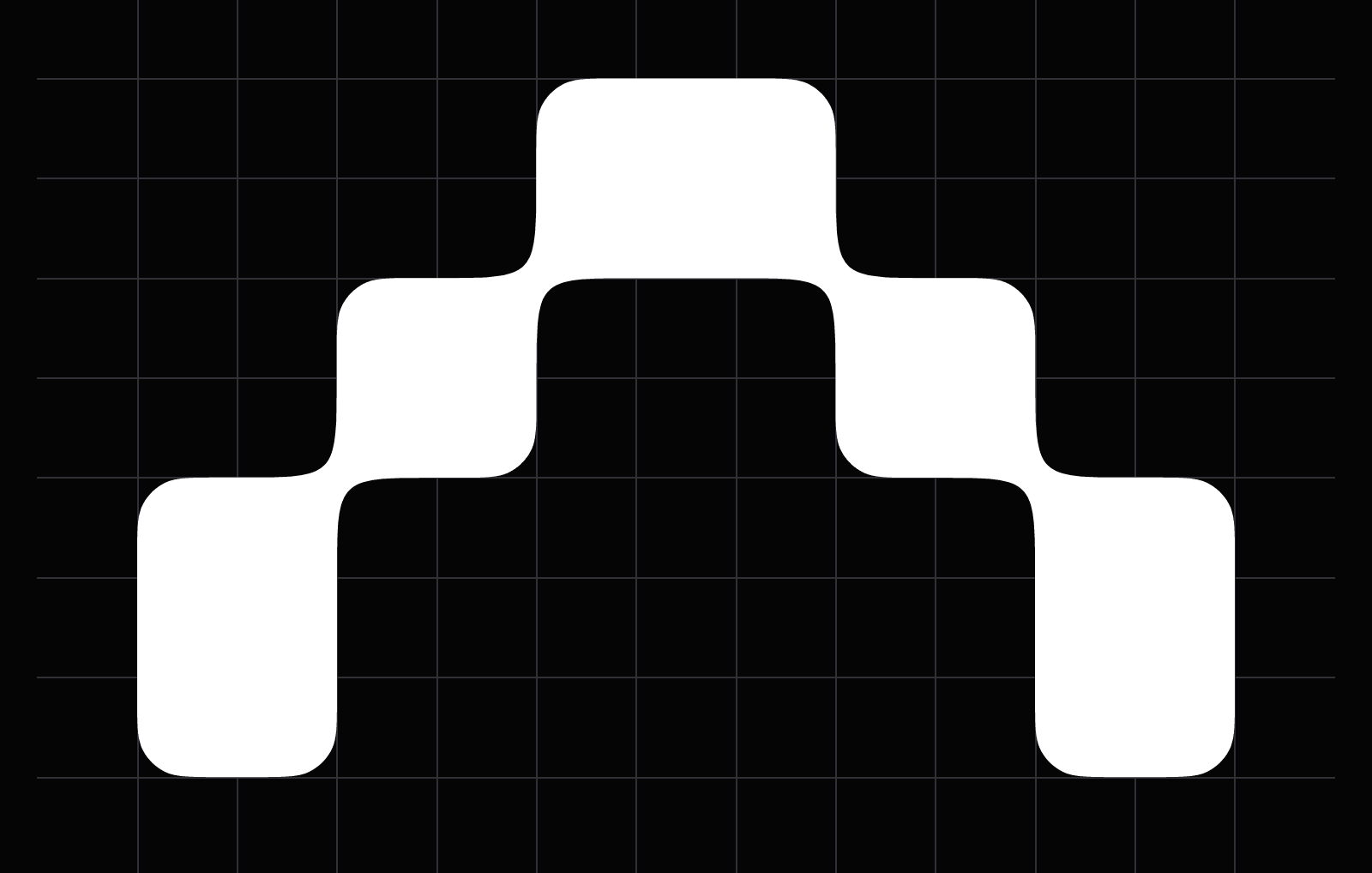
The BytArc mark is five blocks on a grid of 25 units: square blocks of two units and long blocks of three, stepping up to a top block and down again. Where two blocks meet, corner to corner, a soft joint links them, so the arc reads as one piece. Every corner is rounded by half a unit.
On bytarc.com the same blocks draw a picture for each kind of client: a flag for founders, a skyline for enterprises, heads round a table for executive teams, a rocket for startups, rising bars for scale-ups and a gear for operators. Scroll, and the blocks break into the 1s and 0s of a brain.
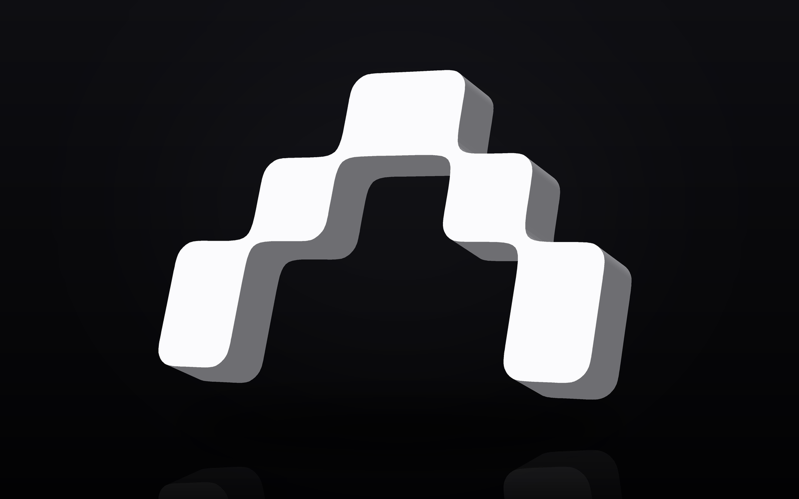
The BytArc logo in 3D
The mark is built to be solid. On bytarc.com its blocks have depth: white faces, silver sides, lit from the top left.

Colours
BytArc is black, white and silver.
BytArc logo files
Use these when writing about BytArc. Keep clear space around the mark of at least one block, and don't stretch, rotate or recolour it beyond black, white and silver.









About BytArc, in one paragraph
BytArc is an independent, founder-led AI studio in Lisbon, Portugal, founded by Tomás Batalha, a former Google business analyst and Amazon business development lead. BytArc automates business processes for growing companies with AI, advises founders and executive teams on strategy, go-to-market and AI adoption, and builds its own AI products. bytarc.com
More on the company: What is BytArc? Press contact: tomas@bytarc.com.